Wednesday, November 19, 2014

Too Many Cooks vs. Adolf Hitler

For our last post of the night, Godwin's Law Art Revue is comparing this 1913 painting by Adolf Hitler

to Adult Swim's Too Many Cooks:


I think we can all agree that this is not even a contest. Too Many Cooks is WAY funnier than HItler's painting.
It's pretty good realism for a Hitler painting, though he kinda gave up when he got to the sky and the trees (never stop reaching for the stars, Hitler!).
It's also a little too pastoral, and Too Many Cooks is definitely commenting upon such dull art. Had Hitler been around in the 1980's, he'd probably have really enjoyed some of the sitcoms that Too Many Cooks parodies (except The Cosby Show!). Honestly, I think he would've loved Bosom Buddies. Nothing makes an old German stuck-up idiot laugh harder than a man in woman's clothing.
He'd probably have been a huge Tom Hanks fan (up 'til Saving Private Ryan anyway.)

It goes without saying that Too Many Cooks has a much more appealing serial murderer in it, though they can't be rated based on appeal. What makes a serial killer valuable? Is it his ability to murder, or is it his style? If it's the former, Hitler wins (though very lazily!) If it's the latter, Too Many Cooks wins hands-down, with the funniest serial killer we've seen all year. 
Too Many Cooks falls apart at the end, but it does start out funny enough that we have to rate this higher than anything we've covered so far.
4 mustaches


And for Hitler? One mustache


and one Smarf


How much is a Smarf worth in mustaches? Who cares, it's art, let it be subjective, or you're making the same mistake Hitler made! You wouldn't want to be compared to Hitler, would you?

Henry Darger vs. Adolf Hitler


Today on Godwin's Law Revue we compare this landscape painting of Adolf Hitler's
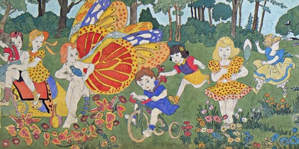
to this portion of Henry Darger's The Story of the Vivian Girls, in What is Known as the Realms of the Unreal, of the Glandeco-Angelinian War Storm, Caused by the Child Slave Rebellion. 

I'd like to start the discussion today by stating that these guys were outsiders in very different ways.
Henry Darger was entirely unnoticed during his lifetime, whereas Hitler was very successful during his life, but history has been very kind to Henry Darger, as opposed to Hitler.
They both have very obsessive tendencies, so if Hitler used his dedication and singlemindedness to make one huge book, he'd probably have succeeded at his original goal of becoming a famous artist, and, inarguably, the world would be a better place, though, come on, Hitler's paintings so far really haven't been that great, so I don't know if I'd want him to have made more.
Though if he'd spent as much time working on them as Henry Darger he might've gotten good.

This is a very nice Hitler painting, actually. The landscape is well-done, the colors are bright and interesting, and the light balance is detailed.
But compared to Henry Darger's detail, Hitler sucks ass.
Darger got so many fascinating weird things in this picture, though I can't say the colors are as bright or exciting as in Hitler's. Darger's content and story can't be contested.
Hitler's is pretty realistic, lightwise, whereas Darger has no light variation or even an obvious light source.
In some ways, what we're doing today is bizarre, because Darger is so fantastical, and Hitler is so tied to reality.
I gotta give Darger a ton of credit for his whole work, though this piece specifically isn't much better than Hitler's. They both get 3 mustaches


Our first tie! Sorry, guys, nothing personal!

Georgia O'Keeffe vs. Adolf Hitler


Today on Godwin's Law Art Revue we compare Georgia O Keefe's cleverly-titled "Blue Flowers"

to Hitler's untitled painting of some flowers in a vase.

I gotta start by saying that all I know about Georgia O'Keeffe is that she was mentioned on Family Guy as only painting flowers that look like vaginas and I think this is a strong argument for that theory. My mom really likes her paintings and growing up it always seemed like an old lady thing rather than a vaginal thing, though I guess those two are the same when you really think about it.

This may be the best painting Hitler did. The colors are good, it looks realistic, the vase is oddly-shaped but that may have been what actually happened. The flowers that fell out of the vase look interesting, compared to many of his dull work we see elsewhere.

O'Keeffe's picture offers me nothing but a slight twinge of horniness.
The color is well-done, almost like neon, but, again, it doesn't interest me much, content-wise, and I keep imagining fucking it.

One interesting thing is that Hitler's flowers look more like flowers than Georgia O Keeffe's do, though hers are saying much more, unless you think of the message as being "paint instead of murdering millions of people," in which case I'd give credit to Hitler's painting for being more meaningful.
That said, Hitler's painting is still not that good, but for Hitler it's pretty high up there.

I give Hitler's painting
2 mustaches


and Georgia O'Keeffe's 3 mustaches


Claude Monet vs. Adolf Hitler


Today we compare Adolf Hitler's 1926 pencil and watercolor sketch to

Claude Monet's famous "Water Lillies."

The most obvious contrast between these two paintings is their use of color.

The Monet is famously a great use of color. There's a gradient, all the colors really stand out, and it looks realistic.
The paint is noticeable on it, which is probably intentional, though it's hard to say about people painting back then. I guess this painting was a big deal because it contrasted with some of the war scenes or whatever people were painting, but the one big complaint I have with this is it's just a very dull painting of some water and flowers. It's no Dali, that's for sure!

As for Hitler's painting, the tree is drawn really well, but the color looks like a 7 year-old's paint-by-number book. I don't think the white spots are on purpose.
There's a suggestion of people on a bridge, but the coloring is so bad that it makes them look like they're having a bonfire, though perhaps that was an accident. There's no gradient in this color at all, it's just solids and white splotches in between.

It's ridiculous to think that Hitler painted this when he was 37. It's like a hobby painting, someone who does paintings in their spare time. He applied to art school, though! He should be capable of more! Shame on you, Hitler, shame on you!

We'll give this Hitler painting one mustache


and this Monet 


George W Bush vs. Hitler (are we the 1,000,000th Blog to use this title for a post?)


Today on Godwin's Law Art Revue we have Adolf Hitler's earliest (and only?) self portrait. He apparently signed his initials over his head as he sat on the stone bridge.
 Where are they written? Are they in mid-air? His megalomania appears to have been going strong even at age 21, as he pointed his own figure out on this painting as if painters are supposed to do that.

I like the watercolors reflected in the water, this one almost has some soul! The shadows of the bridge look realistic reflected in the water. This might be my favorite Hitler painting!


Compared to Hitler today we have George W Bush's recent self-portrait in the shower.
Technically, this is much worse than Hitler's painting. Where is the mirror supposed to be facing? If it's showing me Bush's face, then it should be tilted to the right, but it looks tilted slightly in the other direction. And Bush's face is tilted in the other direction! Also, what's up with his back muscles? They look like his front. He clearly painted this with no sense of how others see him (a common complaint against Bush).
Comparing these though, they reveal that we all have moments of vulnerability, and look both wistful and depressing. Sad and poorly thought out, again like many other choices he made in his life.

The bottom line:
We agree that Hitler's painting here deserves 3 mustaches,


whereas Bush's only deserves 2 out of 4